Making it easier to sell your pre-loved luxury handbag
A platform that helps customers sell their pre-loved luxury handbag in exchange for a Selfridges gift card.
User research, design, prototyping, UX writing, and user testing
E-commerce
UX Designer (me), Tech Lead, QA, PM, Software Engineers, Delivery Lead
Challenge
The platform faced high abandonment rates, long turnaround times between quote receipt and shipping, frequent customer complaints, and accusations of 'greenwashing' due to its resale service requiring customers to send pre-loved bags to a warehouse in Estonia rather than a local facility.
Opportunity
To address these issues, we aimed to bring the service in-house, creating a more sustainable solution while also offering a faster, more seamless experience for customers looking to refresh their wardrobes.
Solution
Redesigned and developed a user friendly, efficient, and seamless tool for sellers to easily get a quote and mail their luxury bag they wanted to sell. Enhanced the seller journey by providing statuses throughout the journey to give them the ability to check on it's whereabouts once it's been shipped, and additionally any status updates for when you would receive your gift card.
Brought the service in house and created an admin tool for internal Customer Service members to manage bags submitted by users.
100%
Reduction in wait times
40%
Increase in ease of use
1
New admin platform
It took up to FOUR DAYS for users to receive their finalised quote in their inbox.
A key pain point discovered while mapping the "as is" user journey during discovery was that the timeliness of receiving a quote was long. I was surprised that users had to wait such a long time!
While discussing this with my team we asked ourselves, How Might We make it quicker for users to get a quote?
Understanding the users
Service Blueprint: I led the creation of the service blueprint artefact, but it required the whole team's cross-functional input on how the entire end-to-end process would work. This is where we had an "aha" moment. What if we gave the seller the ability to view the quote right away instead of waiting for an expert to check through all of the images and get back within a few days time frame? The team chatted through technical feasibility, and it was possible! So we decided we would test this in the new journey.
During the research phase, we identified our two user types: Sellers & Admins.
Key findings for Sellers
Sellers wanted a competitive quote as fast as possible.
Sellers wanted the view the status of their bag throughout the resale journey.
Sellers want to be informed of the whereabouts of their bag once they've mailed it to the warehouse.
Key findings for Admins
Admins wanted a tool would not require too much training to get started.
Admins wanted to be able to view tasks that they needed to do right away.
Admins didn't like complex tools like SalesForce to get their daily work done.
A new and improved journey
Based on the research findings, we restructured the app's journey, creating a new navigation and content, prioritizing features and information according to the user needs.
We also designed the admin journey, and tested with internal Selfridges Customer Service members, who would often use admin tools. They provided feedback on the new design, which we adjusted according to their insights.
It was important to introduce statuses to both the admin and the core user, as during interviews it was uncovered that people wanted to know what was happening with their bag throughout the process. The statuses also needed to be aligned with what the admin was seeing as well, as they were the ones actioning the bags that would trigger updates to the user.
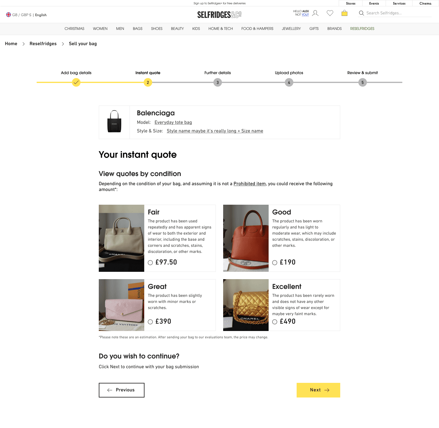
Identifying flow and designs for Milestone 1
To enable the happy path, we defined what designs would be needed.
Validating the solution with core users
We gathered Selfridges customers as participants to test out our new solution. With feedback received, I implemented some iterations.
Iterations
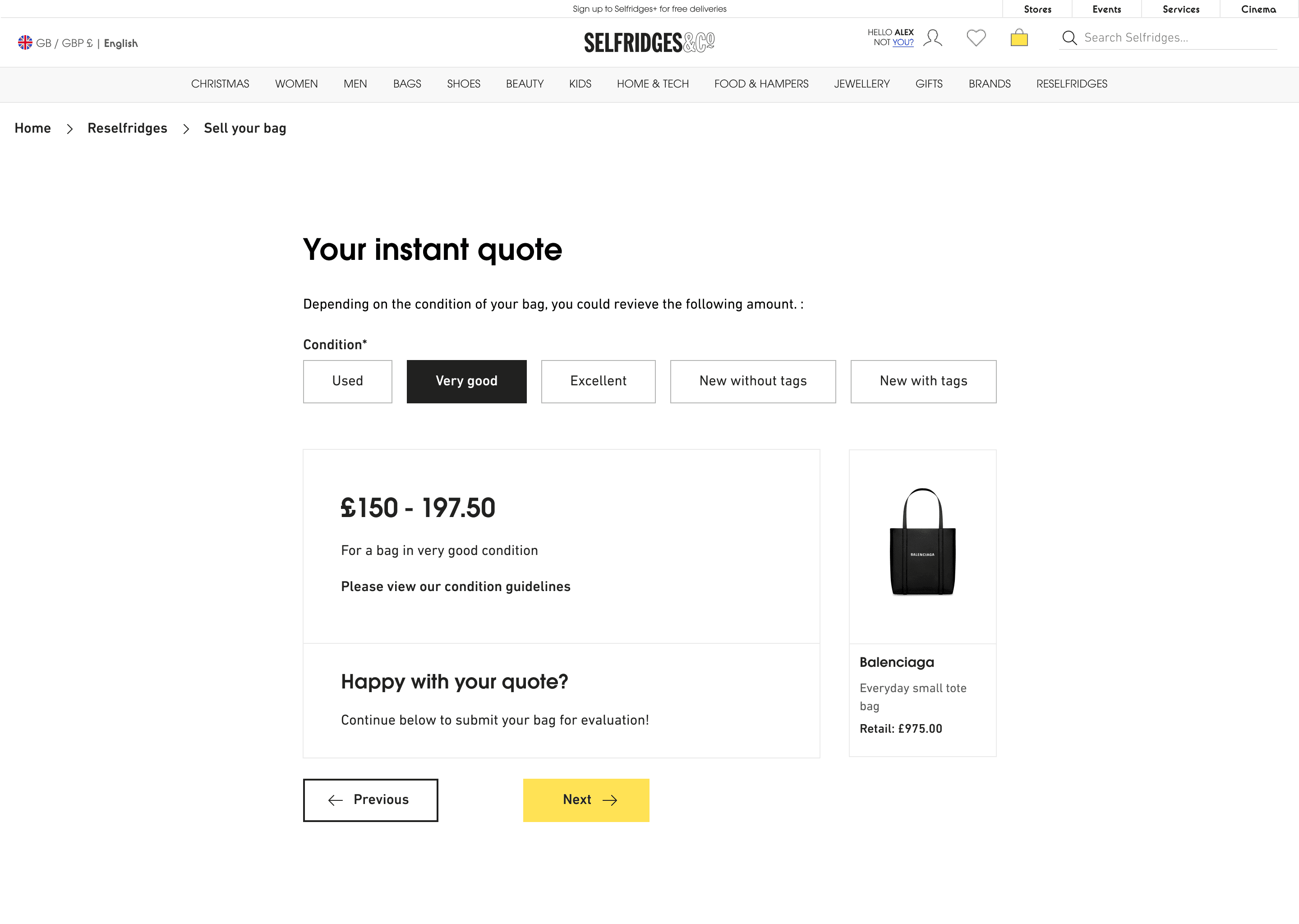
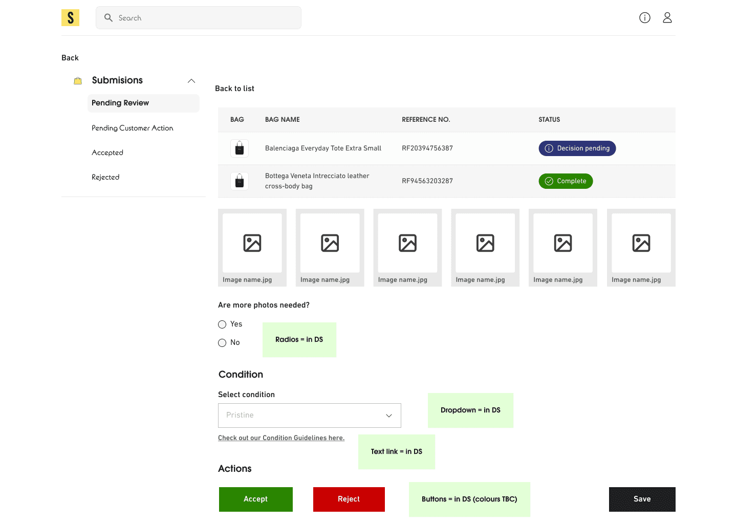
In the first version tested with participants, a few users didn't realise that the top "condition's" we're buttons, and did not interact with those elements.
We were using the Selfridges Design system, so found ourselves slightly limited with components to use for selecting different conditions at the top. We tried out another component for users to interact with but found that using tabs were also not very obvious either.
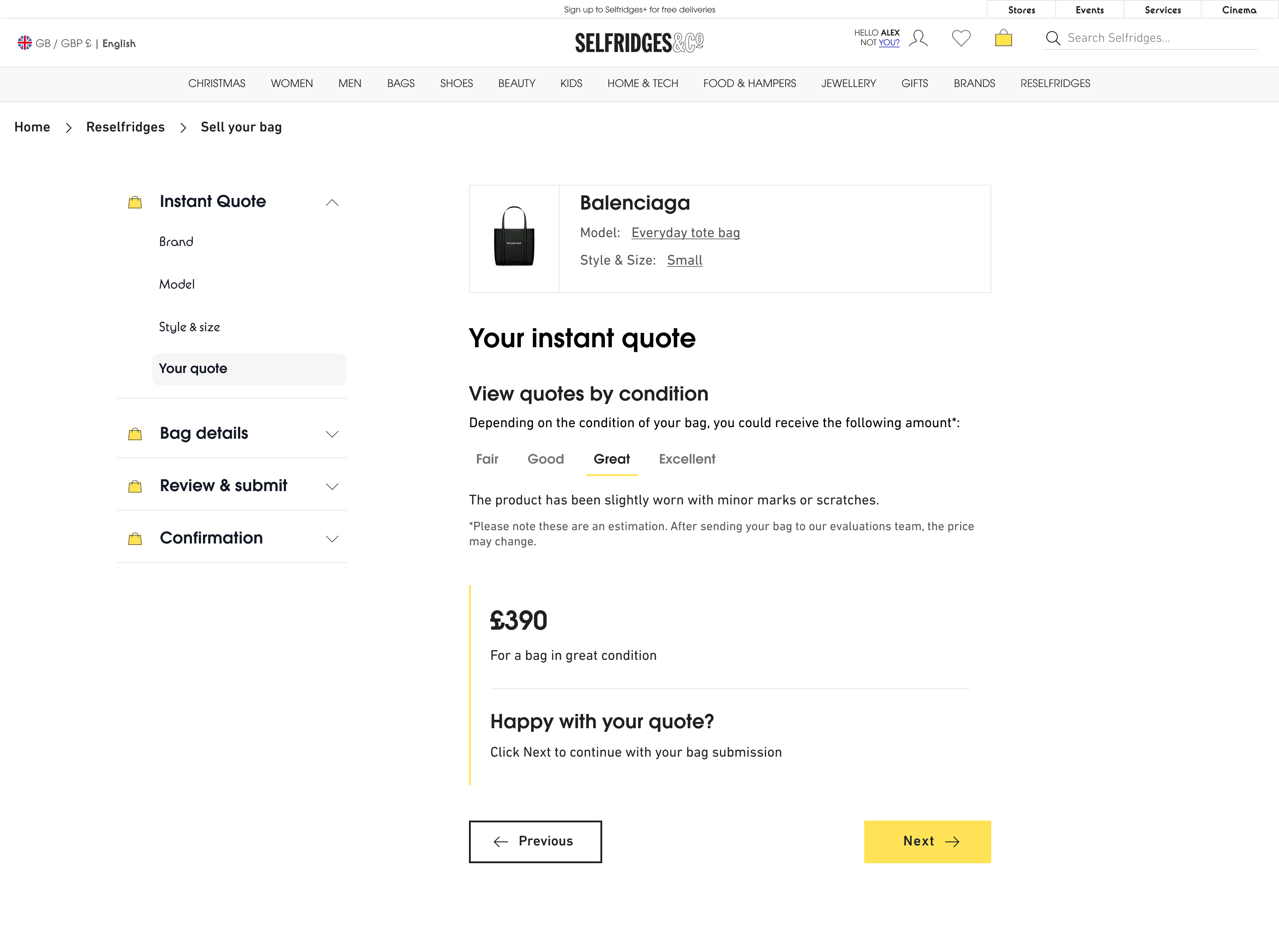
Iterating on the design
This version with radio buttons tested better with users, making it simpler to view the condition types in one view.
Interaction design hurdle
While prototyping the radio buttons, I ran into a huge hurdle. It was DIFFICULT to get this working properly in Figma, and required an entire day figuring out this entire interaction. Luckily I asked my manager for help and we were able to update the conditions to get it working as intended.
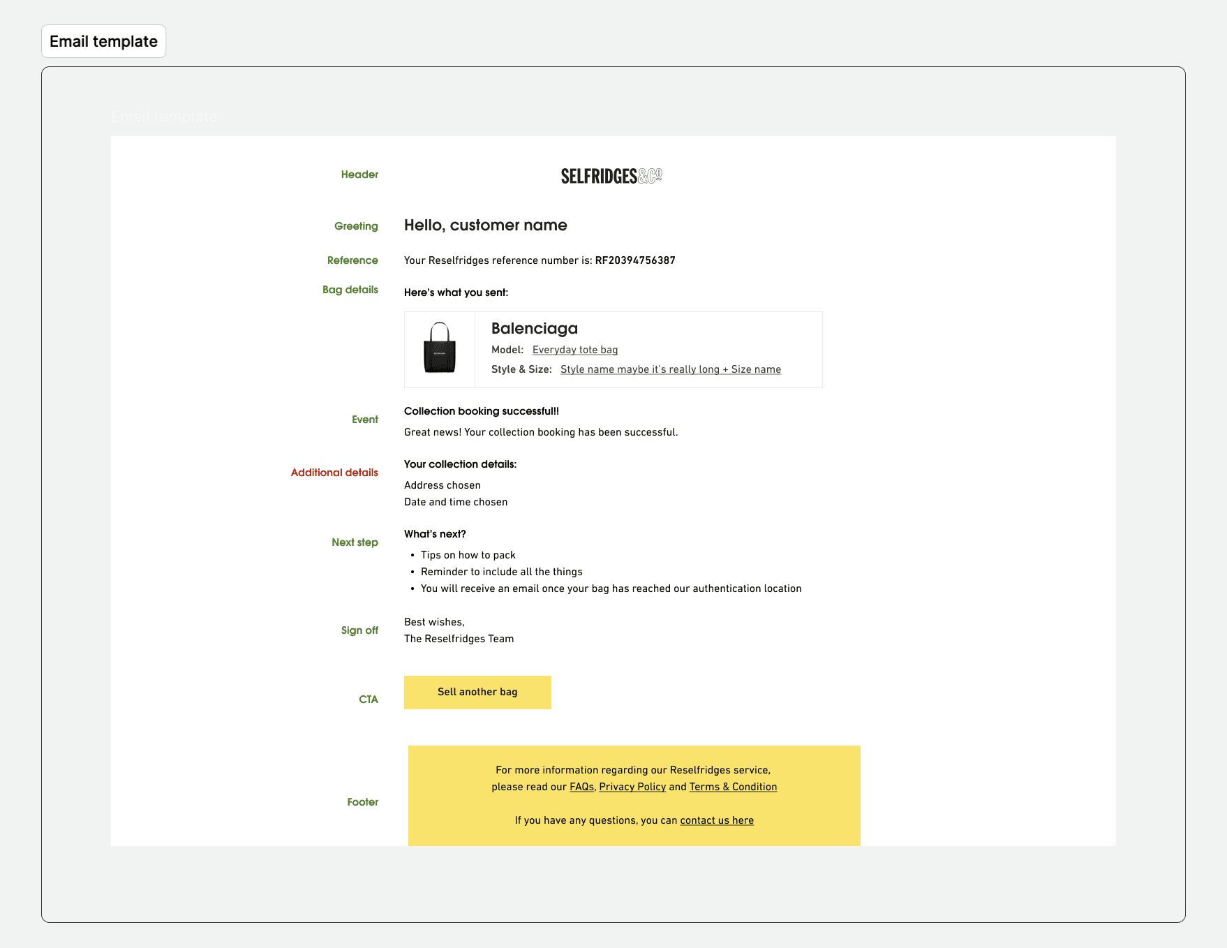
Testing emails and UX copy sent out at various stages of the journey
During user interviews, we uncovered the lack of comms regarding the journey of the bag throughout the process. I created an email template, wrote the UX copy, and tested with Selfridges customers to validate the messaging and comprehension of what was happening throughout the journey.
Testing the flow after users submit their bag
We created a journey for users to be able to check back on the bags they submitted. In the screen below, you can see various bags a user has submitted. Though participants would have received an email regarding action on their bag submission, we created a mock up and prototype to convey a customer having to take action on the bag they submitted for review. The case displayed below showed that the customer had to accept the finalised quote amount.
We tested the concept with customers. Though this was not introduced until Milestone 2, it tested well and made customers feel more empowered that they could check in on the status of their bag at anytime.

Validating the solution with admins
I repeatedly tested the prototype with in house Customer Service team members at Selfridges. We were aiming for an MVP person of the admin platform, so wanted to ensure the main features were validated with team members.
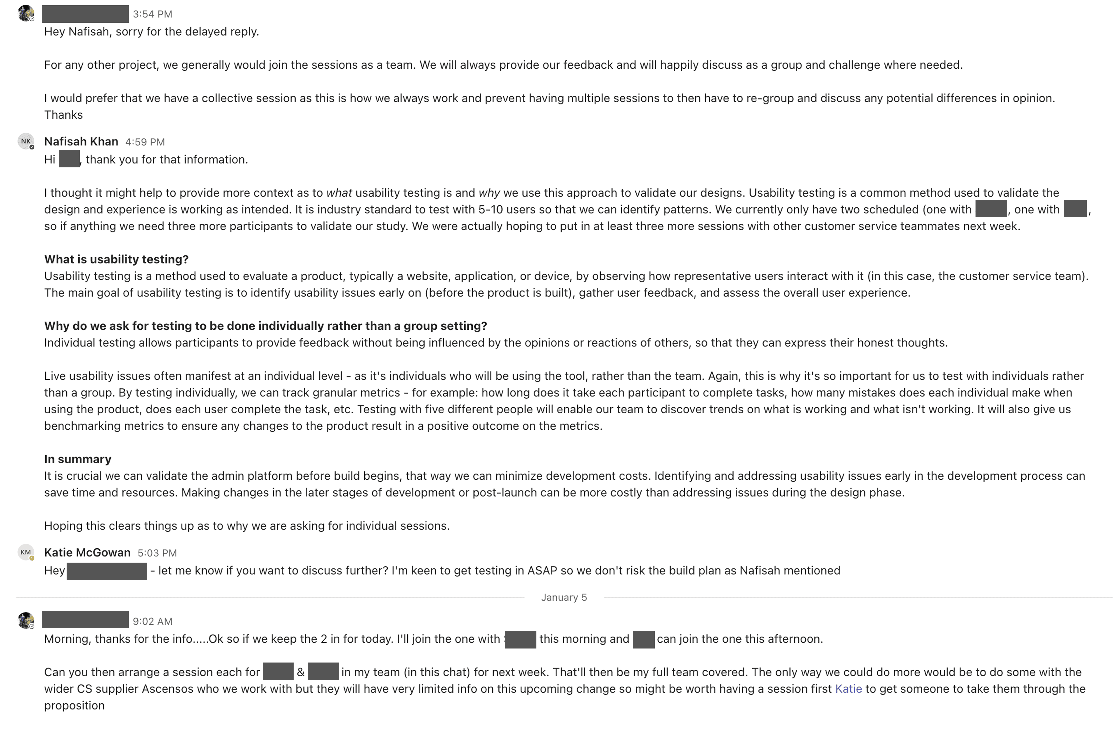
Pushback on testing
While trying to schedule testing for the admin platform, the head of Customer Service insisted on testing the new product in one group, rather than individually. There was a ton of back forth, and I had to put forward an argument as to why it was so important.
After explaining the importance of testing sooner rather than later, he came around! With the explanation I gave, we luckily didn't have issues scheduling future sessions as well…WIN!
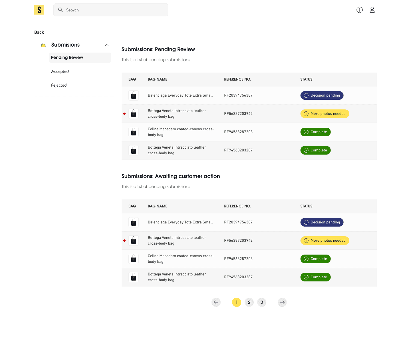
Feedback from first round of testing
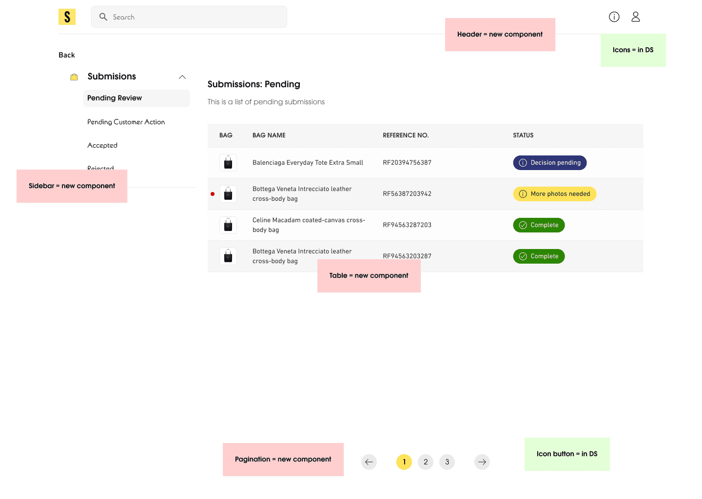
Admins fed back that they did not wish to see anything on their screen that did not require action from them, meaning the two tables displayed above didn't work for them, as the bottom table didn't require any immediate action from them and was actually just submissions that required the customer to complete an action on their side.
Admins also felt that the red dot wasn't clear, and that if something needed to be actioned quicker, it potentially needed another column relating to its due date.
One participant mentioned it would be useful to be able to assign different admins to different submissions to divvy up work.
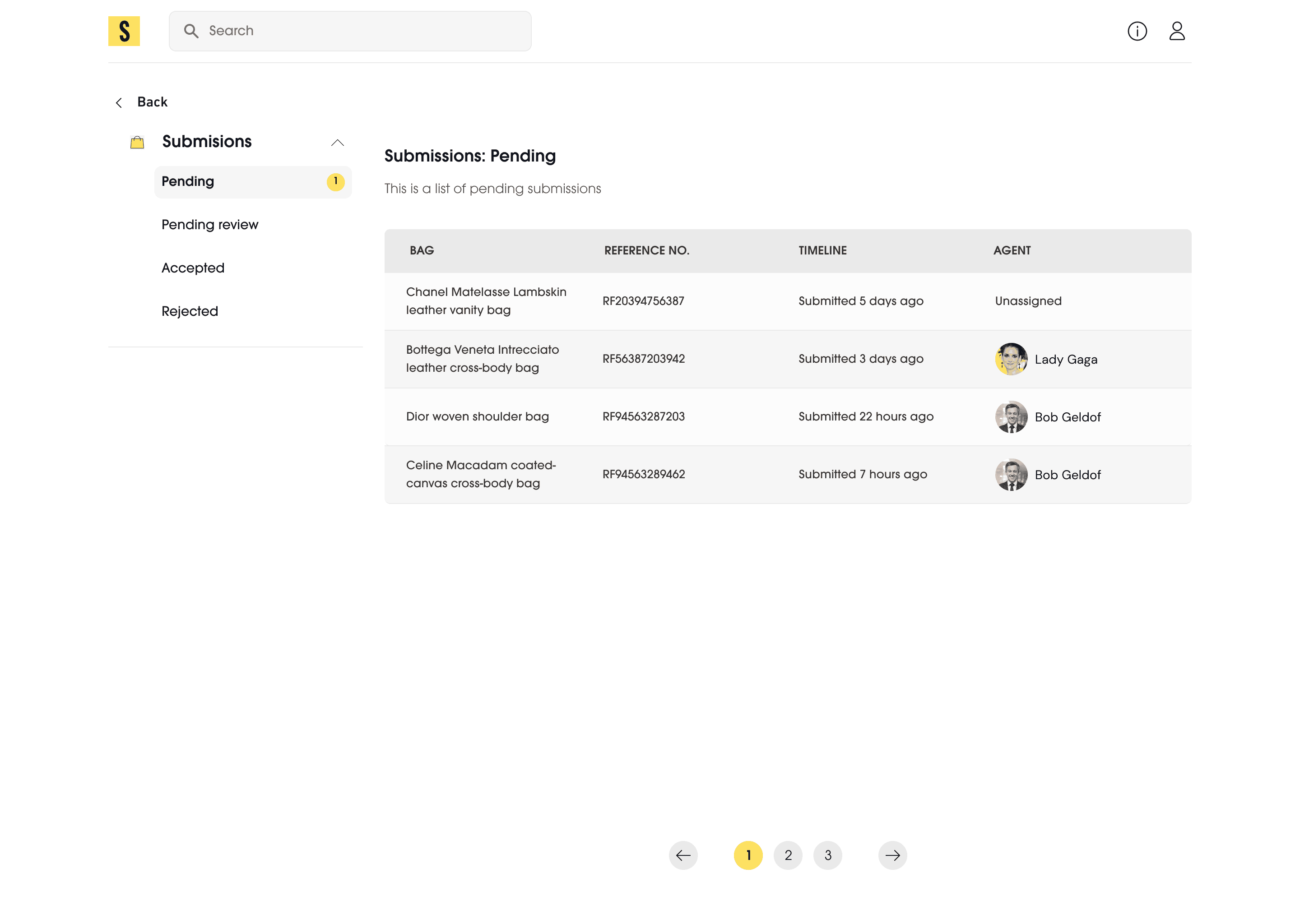
Iterations
Based off feedback, we created another iteration of the design. Though all of the features were not included in the first release of MVP, we knew we wanted to add the ability to assign agents to different submissions. We also updated the sidebar to separate out what admins had to action vs submissions that were waiting on customer action.
New components for the Design System
The admin panel designs required adding new components to the design system that did not exist. As it was a platform for admins, there were elements that did not exist on the e-commerce journey, such as tables, sidebars, and pagination.
I worked on creating the initial components and we had these items reviewed by the Selfridges design team to merge them into the component library.
If I had more time on the project
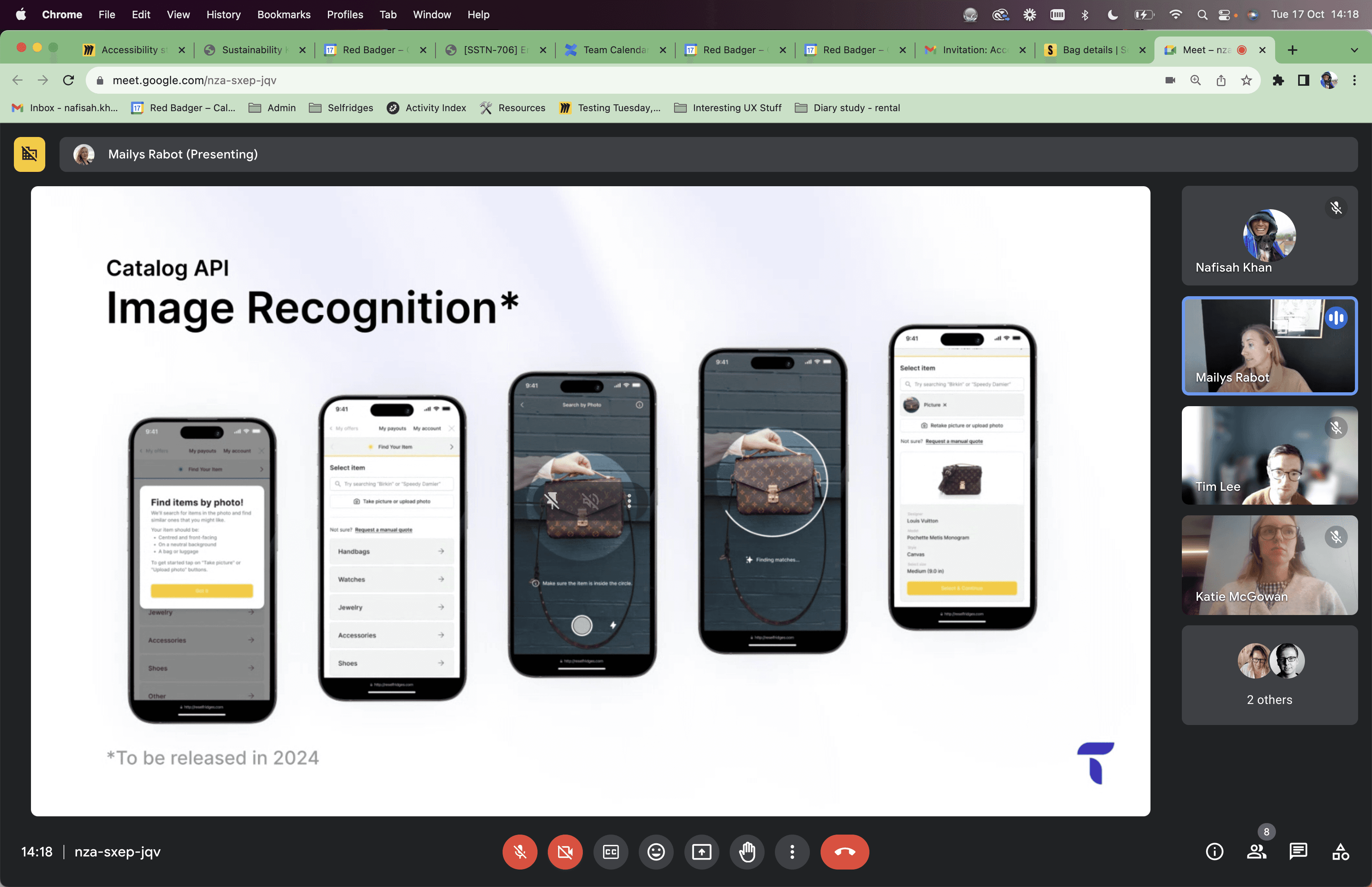
An AI experience
We had a really interesting call with one of the third party vendors where they showcased an AI experience where sellers could open their camera and scan their bag to identify which make and model it was. If I had more time, I would have loved to bring this experience to life, enabling sellers to get a quote even quicker!
Conclusion
The importance of advocacy
Fighting for usability testing, even in the face of internal resistance, underscored the critical role of user research in developing effective tools. This experience reinforced the need to stand firm on user-centered design principles.
Adapting to dual audiences
Designing for both external customers and internal staff required a flexible approach, as the needs and workflows of these two groups were vastly different. Balancing these perspectives was essential to delivering a cohesive solution.
Iterative improvement
Testing and iterating early and often proved essential for addressing usability challenges and refining workflows for optimal efficiency.